Raster to Vector is a stand-alone program that converts scanned drawings, maps and raster images into accurate vector files (such as HPGL, DXF, WMF, EMF, etc) for editing in any CAD application. Any image which is stored in BMP, JPG, TIF, GIF, PNG and more formats can be processed by Raster to Vector into CAD DXF and other vector file formats.Web site: http://www.raster-vector.com
Friday, June 24, 2011
Wednesday, June 22, 2011
How to Choose The Right Color For Your Brand
Color is a Powerful Branding Tool
What is the color of your brand? Color plays an important role and says a lot about you and your brand. Take as an example the Google logo. We can instantly recognize it from its characteristic colors.
What would the Google logo be without its current colors? What if it was colored gray?
While Google’s logo gallery features 1002 logos that include all these humorous cartoon modifications that we see on holidays, and major events, we all know that the combination of the blue, yellow, red and green letters is the distinctive symbol of this major search engine.
Color Bolsters Your Branding Attributes
Think of IBM, a company that is synonymous with Big Blue. Blue shows a sense of security and reliability. IBM’s blue logo, designed in 1972, makes a distinctive statement about the company’s expertise, innovation, service and trust, thereby reinforcing its strength in the industry. It is a great example of a simple, yet attractive and powerful emblem.
Color Enables Brand Recognition
 How do you recognize your favorite brands? The color establishes the identity of business in the eyes of the client more than the actual letters within the logo. Think for a moment a few well-known brands, like Hertz, Avis, National Car Rental and Alamo. You instantly recognize their logo from a long distance because of their unique color.
Color Evokes Emotion
 How true is that, indeed! A woman’s heart rate is said to increase when she is holding a Tiffany light blue box. Tiffany’s color is so important to the brand, they trademarked it.
Tiffany’s Blue Book catalogue was first published in 1878. It’s unique color is now known worldwide as Tiffany Blue, and has become an international symbol of style and sophistication.
Color Helps You Stand Out of Competitors
 UPS is instantly recognized by its brown trucks. “What can brown do for you?”, was UPS’ former advertising slogan. The question is synonymous to “what can UPS do for you?”.
Companies use colors to express their brand attributes. You can do the same for your personal brand. However, be careful, the question you need to ask when choosing your brand’s color is not: “What is my favorite color?” Instead, the right question is: “What color best expresses my personal brand attributes?”
When I started my diet blog which have diet coupons and discounts I thought I would use a blue colored theme because that is my favorite color. I later realized that using a green color would better convey my message of health, relaxation, healing, weight loss, and youth.
So, What Color Is Your Brand?
 Use BLUE, if your brand expresses authority, reliability, truth, intelligence, confidence, loyalty, integrity, wisdom, peace and/or trust.
What famous candy brand used the color blue to revitalize an aging product? M&M’s has been producing their colorful button-shaped candies in brown, yellow, green, orange and red colors since 1941. In 1995, they first introduced the blue color in their candies as an expression of their brand’s continuity, loyalty and authority in the market.
 Use GREEN, if your brand expresses optimism, growth, relaxation, fertility, spring, nature, rebirth, luck, healing, youth and/or environment.
What brand boasts weekly sales of millions of bright green bottles filled with fresh-smelling hair care products? Garnier Fructis hair care products are designed to protect and strengthen the hair to reveal its life, beauty, and shininess. They are widely known for their green color that communicates growth, fertility and rebirth.
 Use YELLOW if your brand expresses happiness, energy, caution, sunshine, warmth, joy, intellect, light, warning, and/or vision.
What city is often associated with yellow, thanks to the high number of its taxis? New York City of course! Over 12,000 yellow cabs have linked NYC to the color yellow.
 Use ORANGE if your brand expresses competition, energy, force, success, encouragement, determination, productivity, potency, and/or vitality.
When my brother Alex, a certified residential energy performance inspector, launched his online venture of energy performance certificates in N. Ireland, he deliberately chose orange as the brand color of his business. He never regretted it!
 Use RED if your brand expresses action, desire, passion, determination, power, potency and/or love.
What brand’s red color can be seen on vending machines, billboards and ads all over the world? Coca-Cola’s red color is instantly recognized everywhere.

Use PURPLE if your brand expresses royalty, ambition, spirituality, mysticism, dignity, mystery, inspiration, wealth, magic, and luxury.
What popular rock star uses purple to brand his name? Prince, of course. In fact, his 6th album is named “Purple Reign” and is ranked among the best albums in the rock music history.
Tuesday, June 21, 2011
Before Hiring A Graphic Designer
Great design can make or brake a business, the first thing your customers will see could make them feel impressed and inspired, or make them look elsewhere to your competitors.
Very often companies can rush into getting a design or brand set up. Time is normally of the essence and as time is money mistakes can be made in haste.
A quick checklist has been compiled that could save time tears and trouble:
1. Research
Have a look at different designers, look through portfolios and see what you like. Get the opinions of others, what looks good to you may not look good to others, so getting the opinions of others for designers you like the look of is a wise move. Have a browse through designers portfolios, check out the range of their expertise. Creative designers like to showcase the range of their work as they are proud of it.
2. Budget
What is the budget you have to allocate to your design/brand. Be realistic, if you are approaching a top design agency with a small budget then you are wasting their time and yours. Great design does not have to cost the earth, but it does take some searching for.
If you are working to a budget, perhaps approaching the project in bite size stages could be best; spreading the cost over a few months of design to allow you to get the best designer possible but giving them the time to work on your campaign.
3. Competitors
What are your competitors doing? How are they presenting themselves, what angle are they taking and what is working for them. With design and branding, fitting into the industry/market is important, but so is standing out in the crowd. Great designers know how to get the balance of making you fit in, yet stand out.
4. Timescale
Honesty is the best policy; once you have found the designer you like the look of you need to be honest about the timescales they have to work with. Most great designers are in demand, and they will need to fit you in. If a designer has lots of spare capacity and free time, the question needs to be asked as to why.
Designers cannot be expected to come up with award winning designs for you if they only have a couple of weeks to research, design, and produce ideas (which then would need to be reviewed by you and whittled down). Sometimes taking a bit more time will pay dividends rather than rushing in like a bull in a china shop.
5. Partnership
Relationship is the key to business, if you have a close relationship with your designer then all the better. Not to say that you need to go around for meals with the family; but having a close working relationship will only add value to your finished product. For you to understand how they work (as designers are creative creatures thought to come from a different planet) and how they understand you (do they really know your business and market place) and your objectives.
By following these practical guidelines you should be able to find the right designer for your project. The world is well stocked with graphic designers, of all shapes and sizes; local, national and global. Choosing a designer based on their ideas, creative skill and background is more important than choosing someone local or cheap.
Marketing Quotes Is a free resource to help UK businesses get help and advice from local graphic designers.
Install Joomla in 2 minutes
When installing Joomla for the first time, verify the system requirements previously stated above first!
Assuming you have a working Apache web server, with PHP and a MySQL Database, you are on your way to installing Joomla.
When you have finished uploading the files and folders, go to your homepage (http://www.yoursite.com or http://yoursite.com/joomla_folder). You should now see a pre-installation check page generated by Joomla.
Pre-installation check

If you don't see the Check page please verify the following:
- Was everything uploaded to your web site?
- Did you remove (and back up) your old web site?
- Do you really have an Apache / MySQL / PHP Web server?
- Do you have a configuration.php file in your Joomla directory?
- If everything checks out ok, and you still don't see the Check page, try: http://www.yourpage.com/installation/index.php This is the direct address for the Check page. If it doesn't show up, or you see a lot of errors and techno mumbo-jumbo, you probably don't have an an Apache / MySQL / PHP Web server.
The pre-installation check page is in three parts. The first checks that your system is able to run Joomla:

The second part are some PHP settings:

The thrid part checks several file and directory permissions:

If everything checks out ok click the "Next button".
If there are some items highlighted in red, please ask your web service provider to correct them. If it is not possible to correct them yourself, you can still click "Next", and see what happens.
The next page displays the license for Joomla.
Licence

If you agree with the terms, click the checkbox next to "I Accept the GPL License" and the click the "Next" button. You will not be able to proceed unless you agree to the license terms.
The next page configures the MySQL database which Step 1 of the installation process.
Installation - Step 1

Enter the configuration of your MySQL Database. The hostname of your database is usually localhost. This means the database server is running on the same computer as your web server. On occasions where localhost is not a usable database server, you will need to contact your administrator.
You are given the option to delete the existing tables in the nominated database and also to backup the tables. You may also install come sample data. If this is your first installation we recommend you check this option.
When you have entered your database information properly, click the "Next" Button. You will be asked to confirm the database operation.

Click OK if you are satisfied that you can proceed. The database will be populated between this and the next step. Any errors that occurred during initialisation of the database will be displayed on the next page.
Installation - Step 2
Step 2 is simply a page where you enter the name of your site.

Enter a name for your site and click the "Next" button. Please note that special characters are usable in this information area.
Installation - Step 3
Step 3 is a page to confirm the installation directory, the url to the Joomla site, your email address and the administrator password.

The email address is for your Super Administrator email. This user account is automatically created for you. The password you enter will be used for your "admin" account. The username for the Super Administrator is "admin". You may change the randomly generated password if you desire.
The permission settings will be used while installing Joomla itself, by the Joomla addon-installers and by the media manager. If you are unsure what flags shall be set, leave the default settings at the moment. You can still change these flags later in the site global configuration.
Click the "Next" icon. The final page confirms the status of the installation and the Super Administrator login name and password.
Installation - Step 4

Do not forget your Super Administrator login name and password as it is not possible to enter the admin section without this. If you lose this information, you must the restart the complete set up procedure.
For security reasons you are reminded to delete the installation folder, and then refresh the page. Until this is done, Joomla will not work.
There are two buttons that will take you to either the Joomla Site or the Site Administrator. If this is your first installation click the "View Site" button. You should see your new Joomla site. Take a moment to explore some menu options. When you are ready, click the "Administrator" link in the Main Menu. Enter the user name and password as you saw them on the Step 4 page.
If this is not your first time then you will know what to do next.
Your set up has now been completed, and you are ready to JOOMLA!
Secret #1 to Facebook fan page design

You don’t have to squeeze your Facebook profile picture into a little box. You have more room than that! You don’t have to use all the space, but it is there for your use.
To claim maximum real estate, design your image so that it is 200 pixels (px) wide and 600px high. You can use that space to have calls to action and interesting design elements.
 To add a new profile photo or graphic:
- Login to Facebook
- Switch to use Facebook as page (the page you want to update)
- Click the Edit Page button which is found near the top right corner of your fan page
- From the menu on the left, choose Profile Picture
- It’s all down hill from here. Just Browse to where your new profile image file is stored on your local computer
- You are done!
- Starting after step #2 above, hover your mouse over your current profile pic. You will see a new button appear over your existing image called Change Picture.
- Click that button, and you can continue with step #5 above.
If you know of any Facebook tips and tricks, send them to me at howto@HowTutorial.com. I’ll be sharing more tips as time goes on.
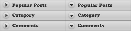
Beautiful jQuery Accordion Tutorial
1. HTML
In this section, we use UL List to form the structure. The first level UL will be the navigation menu, and the second level UL that resides inside each first level UL's LI will be the submenu.
There is some rules over here about the classes and rel attribute, let me explain:
- .popular, .category, .comment Classes in the anchor element (first level) are used for the styling of the menu.
- Rel atribute in the anchor element (first level) is used by javascript to add and remove "selected state" aka change the menu image after it was clicked
- .last Class is used to remove border bottom for the last item
1 2 3 4 5 6 7 8 9 10 11 12 13 14 15 16 17 18 19 20 21 22 23 24 25 26 | <ul id="accordion"> <li> <a href="#" class="popular" rel="popular">Popular Post</a> <ul> <li><a href="#">Popular Post 1</a></li> <li><a href="#">Popular Post 2</a></li> <li><a href="#" class="last">Popular Post 3</a></li> </ul> </li> <li> <a href="#" class="category" rel="category">Category</a> <ul> <li><a href="#">Category 1</a></li> <li><a href="#">Category 2</a></li> <li><a href="#" class="last">Category 3</a></li> </ul> </li> <li> <a href="#" class="comment" rel="comment">Recent Comment</a> <ul> <li><a href="#">Comment 1</a></li> <li><a href="#">Comment 2</a></li> <li><a href="#" class="last">Comment 3</a></li> </ul> </li></ul> |
2. CSS
CSS is pretty simple, we are using two UL Lists. So, what we do is, style the first level UL, skin it with images, and after that, style the second UL List and hide it.Have you heard about CSS Sprite? CSS Sprites are the preferred method for reducing the number of image requests. Combine your background images into a single image and use the CSS background-image and background-position properties to display the desired image segment. Yes, this is the image we are using for this tutorial:
And, if you wish to learn more about CSS, you can read my previous posts:
1 2 3 4 5 6 7 8 9 10 11 12 13 14 15 16 17 18 19 20 21 22 23 24 25 26 27 28 29 30 31 32 33 34 35 36 37 38 39 40 41 42 43 44 45 46 47 48 49 50 51 52 53 54 55 56 57 58 59 60 61 62 63 64 65 66 67 68 69 70 71 72 73 74 | /* First Level UL List */#accordion { margin:0; padding:0; list-style:none;} #accordion li { width:267px; } #accordion li a { display: block; width: 268px; height: 43px; text-indent:-999em; outline:none; } /* Using CSS Sprite for menu item */ #accordion li a.popular { background:url(menu.jpg) no-repeat 0 0; } #accordion li a.popular:hover, .popularOver { background:url(menu.jpg) no-repeat -268px 0 !important; } #accordion li a.category { background:url(menu.jpg) no-repeat 0 -43px; } #accordion li a.category:hover, .categoryOver { background:url(menu.jpg) no-repeat -268px -43px !important; } #accordion li a.comment { background:url(menu.jpg) no-repeat 0 -86px; } #accordion li a.comment:hover, .commentOver { background:url(menu.jpg) no-repeat -268px -86px !important; } /* Second Level UL List*/ #accordion ul { background:url(bg.gif) repeat-y 0 0; width:268px; margin:0; padding:0; display:none; } #accordion ul li { height:30px; } /* styling of submenu item */ #accordion ul li a { width:240px; height:25px; margin-left:15px; padding-top:5px; border-bottom: 1px dotted #777; text-indent:0; color:#ccc; text-decoration:none; } /* remove border bottom of the last item */ #accordion ul li a.last { border-bottom: none; } |
3. Javascript
There are two major sections in this javascript click event:- First section: Reset everything back to default. What it does, hide all the submenus and also reset all the arrow to default position.
- Second section: Display the selected item and change the arrow direction
It gets a little bit tricky in resetting the arrow back to default position. I'm using for each method to loop thorugh the menu, grab its REL and and remove the classes. I think there are different ways to accomplish it. If you do know a better way, please let me know and I will ammend it.
1 2 3 4 5 6 7 8 9 10 11 12 13 14 15 16 17 18 19 20 21 22 23 24 25 26 27 28 29 | $(document).ready(function () { $('#accordion li').click(function () { /* FIRST SECTION */ //slideup or hide all the Submenu $('#accordion li').children('ul').slideUp('fast'); //remove all the "Over" class, so that the arrow reset to default $('#accordion li > a').each(function () { if ($(this).attr('rel')!='') { $(this).removeClass($(this).attr('rel') + 'Over'); } }); /* SECOND SECTION */ //show the selected submenu $(this).children('ul').slideDown('fast'); //add "Over" class, so that the arrow pointing down $(this).children('a').addClass($(this).children('li a').attr('rel') + 'Over'); return false; }); }); |
Conclusion
Like this tutorials? You can express your gratitude by visiting my sponsors on the sidebar, bookmark it and help me to spread this tutorial to our friends! :) Thanks!
Monday, June 20, 2011
5 Principles of Effective Logo Design
Now that you know what a logo is supposed to do, and what it should represent you now must learn about what makes a great logo aka; the basic rules and principles of effective logo design.
1. A logo must be simple
A simple logo design allows for easy recognition and allows the logo to be versatile & memorable. Good logos feature something unexpected or unique without being overdrawn.
2. A logo must be memorable
Following closely behind the principle of simplicity, is that of memorability. An effective logo design should be memorable and this is achieved by having a simple, yet, appropriate logo.
3. A logo must be timeless
An effective logo should be timeless – that is, it will stand the test of time. Will the logo still be effective in 10, 20, 50 years?
4. A logo must be versatile
An effective logo should be able to work across a variety of mediums and applications. For this reason a logo should be designed in vector format, to ensure that it can be scaled to any size. The logo must work in just one colour too.
5. A logo must be appropriate
How you position the logo should be appropriate for its intended purpose. For example, if you are designing a a logo for children’s toys store, it would be appropriate to use a childish font & color scheme. This would not be so appropriate for a law firm.
For further reading on the rules and principles of great logo design I highly recommend to read the logo design tips from Logo Factory before continuing and also the article
Anybody can design business card using photoshop
Why pay someone to make business cards for you when you can do it yourself? All you need is Adobe Photoshop, a printer, and some cardstock (available at Staples or similar stores). This tutorial will teach you how to make a basic business card. This is by no means the only way, and you can alter the design any way you want. Just do whatever you think will look best. Let’s get started.
1. First, create a new document in Photoshop. It should have the settings below.

2. Now, you should have a blank canvas sitting in front of you. If you have a logo you want to use, go ahead and incorporate it. Otherwise you can whip something up now (or just use some other image relevant to the card). I’ll use a picture of an Apple Mac Pro, since I’m too lazy to make a logo. Whatever image you use, it needs to be converted to the same resolution as the card (300 dpi). To do that, open up the image and click Image > Image Size. If the resolution is not listed as 300, change it (and make sure the result looks fine). It may look a touch blurry if you zoom in a lot, but you can’t really tell until you print it out for the first time. Don’t worry about the size of the image, you can always use Free Transform (Ctrl+T) on it later.

3. Paste the logo or other image into your card document. Use Free Transform (Ctrl+T) to resize it to the proper size. Drag the logo over to the left of the canvas. It should look something like this.

4. Now get out your Text Tool. Set it for about 36pt and choose black as the color. Pick a font (I chose Diamond SF, which you may or may not have). Add the name of your company/website in nice big letters. I right-clicked the type and chose “Faux-Bold” to give the text a bit more power.

5. Now you can fill in some more information about your company/website. Use a more legible font like Garamond, Times New Roman, or Verdana. For a font size, use a smaller level (like 8-12pt). You should get something sort of like this:

6. The business card is starting to shape up nicely. You can stop adding stuff now and have a nice, clean-looking card, or you can continue to add more stuff to the card. For example, a semi-transparent Apple Logo would look nice.

7. Now the card is about finished. We need to make some final preparations, though. We need to put a small border around the edges of the image so we can cut the cards apart after they’re printed. Make a new layer (Ctrl-Shift-N) and hit Ctrl-A to select everything. Go Select > Modify > Border, and enter a value of 5 pixels. Hit enter. Now set your foreground color as black. Hit Shift-F5 and select “Foreground Color” from the dropdown. Press OK. You can now deselect with Ctrl-D. You should end up with something like this:

8. Go ahead and save your image. You have a few choices to print your cards. I think there’s an entry in the File> Automate menu that will print an image several times on one piece of paper. If not, then you can “Copy Merged” (Ctrl-Shift-C) and Paste the image several times into a new document (7.5 x 10 inches at 300 dpi). Arrange them and then print that document. I reccommend printing onto normal paper first to make sure everything is all right. If it works, load up the cardstock and print.
9. Use scissors or a paper cutter to slice the sheets into individual cards.
10 (because you can’t have a tutorial with only nine steps). Hand your nice new business cards out people, tack them up on bulletin boards, or whatever you do with business cards.
Well, that’s all folks! Business cards are a useful thing to have if you’re a website, an individual, or…well…a business. I have some cards for the websites I run, so I don’t have to find a pen and scrap of paper if someone wants to know the URL. I tack them up on bulleting boards too.
Happy Photoshopping!
1. First, create a new document in Photoshop. It should have the settings below.
2. Now, you should have a blank canvas sitting in front of you. If you have a logo you want to use, go ahead and incorporate it. Otherwise you can whip something up now (or just use some other image relevant to the card). I’ll use a picture of an Apple Mac Pro, since I’m too lazy to make a logo.
Whatever image you use, it needs to be converted to the same resolution as the card (300 dpi). To do that, open up the image and click Image > Image Size. If the resolution is not listed as 300, change it (and make sure the result looks fine). It may look a touch blurry if you zoom in a lot, but you can’t really tell until you print it out for the first time. Don’t worry about the size of the image, you can always use Free Transform (Ctrl+T) on it later.3. Paste the logo or other image into your card document. Use Free Transform (Ctrl+T) to resize it to the proper size. Drag the logo over to the left of the canvas. It should look something like this.
4. Now get out your Text Tool. Set it for about 36pt and choose black as the color. Pick a font (I chose Diamond SF, which you may or may not have). Add the name of your company/website in nice big letters. I right-clicked the type and chose “Faux-Bold” to give the text a bit more power.
5. Now you can fill in some more information about your company/website. Use a more legible font like Garamond, Times New Roman, or Verdana. For a font size, use a smaller level (like 8-12pt). You should get something sort of like this:
6. The business card is starting to shape up nicely. You can stop adding stuff now and have a nice, clean-looking card, or you can continue to add more stuff to the card. For example, a semi-transparent Apple Logo would look nice.
7. Now the card is about finished. We need to make some final preparations, though. We need to put a small border around the edges of the image so we can cut the cards apart after they’re printed. Make a new layer (Ctrl-Shift-N) and hit Ctrl-A to select everything. Go Select > Modify > Border, and enter a value of 5 pixels. Hit enter. Now set your foreground color as black. Hit Shift-F5 and select “Foreground Color” from the dropdown. Press OK. You can now deselect with Ctrl-D. You should end up with something like this:
8. Go ahead and save your image. You have a few choices to print your cards. I think there’s an entry in the File> Automate menu that will print an image several times on one piece of paper. If not, then you can “Copy Merged” (Ctrl-Shift-C) and Paste the image several times into a new document (7.5 x 10 inches at 300 dpi). Arrange them and then print that document. I reccommend printing onto normal paper first to make sure everything is all right. If it works, load up the cardstock and print.
9. Use scissors or a paper cutter to slice the sheets into individual cards.
10 (because you can’t have a tutorial with only nine steps). Hand your nice new business cards out people, tack them up on bulletin boards, or whatever you do with business cards.
Well, that’s all folks! Business cards are a useful thing to have if you’re a website, an individual, or…well…a business. I have some cards for the websites I run, so I don’t have to find a pen and scrap of paper if someone wants to know the URL. I tack them up on bulleting boards too.
Happy Photoshopping!
Logo Design Trends in 2011
The 2011 Trend ReportEvery year, it’s worth noting that this is a report on trends, not a recipe book of styles. It is also not a finite list: There are other valid trends out there that are not mentioned here.
The report should serve you as an ongoing view of where logo design is headed. The word “trends” in itself can have a very negative cast, but in truth, trends aren’t bad. They reveal our growth. It’s our take on them that allows us to move even further forward.
Not every trick in the designer’s palette has to be over the top: Subtlety can certainly play a role in the ongoing battle to capture the eye of the consumer. In a number of logo designs, a gentle linear gradation is taking hold—just a modest tweak to a flat, single color solution. The color gradation may be no more than a ten percent shift of color value, or it may be more dramatic, like Chermayeff & Geismar's Women’s Tennis Association logo, which veers from a magenta to a deep violet
This direction allows designers to create a solution that visually coveys a message of motion or change in coloration but not through the vector shape or image. This is a continuation of trends identified over the last two years that have seen designers being more likely than ever to use the surface of a mark as an opportunity to introduce an additional statement.
From a technical perspective, this presents a formula and reproduction challenge that must be monitored. Simple linear gradations are notorious for shifting between platforms and file types. If monitored with vigilance, though, the rewards will exceed the grief.
These are logos that look like Napster had his way with Hello Kitty: All are far too cute, with the smell of cigarettes on their breath. I believe we have seen this coming for some time, but this last year the trend reached a tipping point. Designers’ fascination with the social culture characters has lead to the adorable personification of the logo design industry’s output.
Society has become comfortable with the endorsement of anything bearing a smile. Gaming characters, Twitter birds, manga literature—all inundate a new generation. At every on screen pop-up, there is an opportunity to have your own mug shot translated into a two-dimensional avatar.
These aren’t just the cereal box advertising characters that coaxed a generation to the breakfast table. These logos are simple, often geometric and monoweight in line. Anticipate their audience to be tech savvy and relatively new to a paycheck.
What was a mark of poor printing craftsmanship for generations is now rearing it head to remind us of the medium. That slight misregister that caused visual vibration that could blind a reader halfway through a paragraph is now a confusing part of some logo specifications. Registration was once considered a CMYK printing issue only. Now the issue of focus is a part of the 3D movie experience when a patron removes his or her special glasses to wipe them clean of hot buttered fingerprints.
Either of these experiences reminds the consumer that there is a technical reason that great work looks great. These logos pull back the curtain to reveal the magic pre-primetime. There is no contesting their confrontational aspect. Much like an optical illusion demands, the consumer must give them a second look. But will the audience get the inside joke? The question may be, is the design mishap blatant enough to keep the consumer from simply believing that the designer was inept.
Yes, it’s an O! A veritable avalanche of full 360-degree, non-elliptical but very perfected, and thick as a cross-section of a suspect coronary artery logos are upon us. Kudos to each for finding some graphic differentiation through modification to its surface or supporting cast of shadows, bars, dot, stars, and stripes, and so on. As clean as these are, I am starting to miss a nice Bodoni O with a bit of line variance or maybe a forward-leaning italic O: With those, I know I’m looking at a letter and not just a vacuous circle. The difference between an O standing for something and a zero standing for nothing is slight indeed.
You would have to assume the Obama logo that was rightfully acclaimed for breaking ground and tradition in the realm of politics must share in the responsibility for this trend. As fresh as that mark was, its ubiquitous presence may end up accelerating the expiration date on followers. Consumers may well identify these similarities, leading you to ask: Will they believe there is an implied affinity between them, and will this influence their opinion of this entity?
This is the solution for the client who wants to see his logo include everything on the Earth. Literally. Stylistically, this could certainly be broken into two categories: worlds with a perimeter populated by topical detail or worlds built out of topical detail. Since both variations have emerged simultaneously, we’ll treat them as the sustainability solution du jour. There is a certain whimsy about these logos, with their silhouette characters populating the orb like Gullivers in the land of the Lilliputians.
Part of the charm here is the dense amount of detail in a limited space. It starts to address the importance of our cohabitation and mutual respect as this big green cargo van is hurled round the sun. No attempt is made to define land mass or prime meridians, just a loosely round object with an exaggerated gravitational pull to keep its passengers on board. Minutia on a logo is generally avoided as it can vanish when scaled down, but this group seems to transcend this tenet by inviting the viewer to enter, magnifying glass in hand.
An old rule of thumb to the socially adept was you can never to too rich or too thin. There is a certain elegance in an ultra-thin line, and this has never been lost on designers. Challenging as these may be on aging eyes, when designed well and not under-scaled, they will coax a pair of readers from the viewer’s pocket.
More than a few typographic marks have also picked up a spa membership in the last year. This is seen in script and in san serif display type. Note that in the type and illustration solutions, the line is not variable but rather a mono-weight.
A single client having a series of logos is absolutely nothing new. This is a time-tested solution to maintaining a core, consistent visual identity while focusing on specific divisions, products, or services. What is remarkable is the sudden ubiquitous deluge of these family marks.
In some cases, there is a parent mark that the family is constructed to relate to. Yet in others, every logo is of equal importance, and there is no single flagship logo. Nickelodeon exemplified this years ago with a common typographic solution knocked out of an orange field of fill-in-the-blank. But that solution relied more on the volume of solutions rather than the specificity of topic.
One consideration might be the expansive adoption of icon sets for mobile devices or Internet apps, which have built greater consumer familiarity with the concept of allowing a core icon to be redressed to take on multiple focuses. Color-coded series can be the least effective of these if the audience must memorize a system. Equally dangerous is the consumer not recognizing that a single mark is part of a greater system because of lack of context.
Every year we see color preferences ebb and flow, and if notable enough, we will mention this in the also-ran section at the end of the report. This year, with full apologies to UPS, designers discovered what brown could do for them. This was an abrupt and more universal movement, which warrants its appearance in the trend section.
It’s as if the volume knob had been pegged on black for maximum contrast for the last two decades, and we suddenly discovered it could be turned down and consumers could still hear us. This movement is about subtleties and is indicative of a new generation. Tone ranges from sepias, to chocolates, and even warmer.
Saturation levels of secondary colors have dropped back as well. Pinks always work well with brown, but other colors are being paired up here as well. Generally, these are clean colors that have had their chroma drained by half.
Proof that a little interference can truly break the tension. Any of these logos could survive without the dusting of white, but it is what helps set these marks in a hand-crafted genre and makes them more approachable. Crumpling, creasing, skewing, and distressing the art to create the prewashed look has been popular for years. This subtle effect has a few of its own differences that set it apart from the common methods of abuse.
This spritz of the logo surface is not always universal. More often it is applied only to specific areas of the mark. The open negative areas allow for the substrate to peek through, giving the logo a strong sense of place. If there is an attempt to emulate a look, it may be that of a block letterpress print that wasn’t liberally inked. Because only limited areas of the mark may use this effect, these logos are able to live with one foot in the future and another in the past.
Yes, they are pushing the boundaries on acceptable levels of detail and reproduction challenges. But this crop of logos has an almost hypnotic optical mystique to charm the consumer. Repetition of fine lines concentrically crafted to play out an image may symbolically achieve the same effect as the cross-section of a tree telling the story of a life. It can be the tale of a journey or the timeline of a process. Scientific in nature, the creation of these marks is closely tied to the technology that helped spring them to life.
These designs are almost a cross-pollination of Spirograms (mentioned as a sidebar last year) and Jawbreakers (discussed in the trend report from three years ago). Many of these may conjure up a Timothy Leary moment. Whether used as the foundation of the mark or just as a portion, these solutions have dizzying impact on the viewer. This challenges, and like it or not, forces the consumer to confront the mark. They demand a reaction.
 Spoiler alert: The following trend deals with the surface treatment of logos. Jump to the next trend if hand-wringing of more than two hours is likely to result.
Seriously, while we all love discovering a logo that combines solid draftsmanship with clever concept and a memorable shape, we also have to acknowledge that exploration of diverse surface technique is a thriving business. Designers are hell-bent on discovering and laying claim to the next genre of surface decoration.
Marks in this latest group have a special looseness and casual appeal. A clearly handcrafted loopy, loopy line is applied to the surface of an otherwise unremarkable but recognizable shape. In fact, this scribbling is the punch line to the logo. No pretentious calligraphic thick and thin strokes here. The whole affair is once again crafted using a monoline technique, which has become a common thread in several of this year’s trends. Other noted logos this year were silhouettes, similarly filled with a more erratic scrawl, but they lacked the modest panache exhibited here.
Exhibiting symptoms of an identity disorder, these marks demonstrate signs of being perfectly happy in flatland when suddenly they want to roll up off the page for a stroll in the 3D world. These marks are often constructed of a band that could be colored plastic or some other extruded substance. The notable identifier is the need to create a shadow on one’s self when turning a corner, but not casting a shadow on the page as they are not really of our world. Some examples of this trend have pretty grandiose dimensional tendencies, while others merely hint at an attempt to take flight.
Embracing the pleasures of working with gradients, designers are discovering that dimension plus shape equals unexplored territories. Flat, lifeless concepts take on pleasurable dimension that is attractive to the consumer’s eye. Though not the only one, this technique presents a graphic compromise for the purist between flat vector shapes and the crystal-capped dimensional hysteria of the last decade. The Microsoft Office for Mac suite icons formally cast long shadows and had a full-on dimensional appearance with bulbous shapes covered with light pings. Frog Design has dramatically reigned in the dimensionality and the shadow, as seen here.
What is it about this shape? It continues to reoccur in broadly differing incarnations. It’s an unexplained obsession, like when Richard Dreyfuss tries to craft the alien landing site out of mashed potatoes in “Close Encounters of the Third Kind.” We’re calling them “comma” because they look like a large, dimensional comma or maybe a bit of a nautilus shell playing out the concept of mathematical perfection. There’s a swirl in play that tells us motion is a part of the story as well. Or maybe it is a seed unfurling as it prepares to spring into life in a new form.
The rendering of these obviously varies but the primary commonality in these examples is the transparency, with dimensionality dialed way up and a color palette that vividly attaches us to nature in an unearthly way. Like the Orb trend seen years ago, these marks seem to be imbued with a visual magic that tells the viewer not to look for reasoning but just believe.
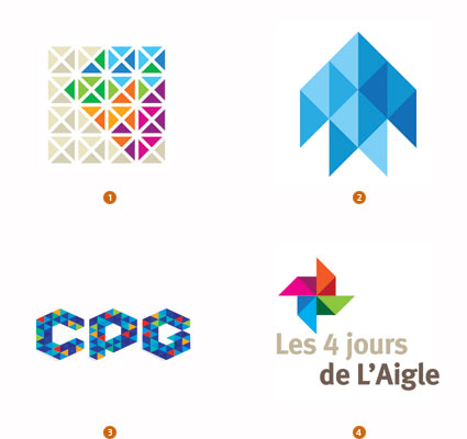
Tangrams be damned. As Buckminster Fuller (father of the geodesic dome) suggested, the triangle is the only flex-cornered polygon that holds its shape. Ergo, it alone accounts for all structural shaping in the universe. Like those building blocks of the universe, designers are embracing the use of a field of these modules to carve out space, dimension, and shape. The clustering of many triangles to form a greater whole tells the story of strength in numbers, and it can also create a mosaic of diversity.
Bass Ale took ownership of the single red triangle as one of the oldest recognized trademarks on record. Though that single perfect geometric shape is certainly iconic, it is also an unpleasant bear with which to design. Single triangular logos are certainly stable, but they nestle poorly with type and can create awkward negative areas. Pair them, triple them, or batch them up, and they become a wonderful, malleable skin that can be arranged to take on nearly any shape or dimension—and with Bucky’s approval as the strongest shape in the universe.
When is an Apple not an apple? When is a Blackberry not a blackberry? When they are symbolic of the world’s leading brands in technology, innovation, and communication. So the leap to viewing a piece of fruit as an iconic representative for something other than an orchard or a jelly manufacturer is not unfathomable. Over the last year, this sweet nugget of nature’s perfection has been everywhere in the field of identity.
Every type of fruit is a vestige of stories and memories consumers can relate to. It is a tactile, familiar, and generally sweet spokesperson for nature and sustainability. They represent the result of our labors and proof of work performed, and are a symbol of purity and procreation all in one.
These self-contained reproduction vehicles are packed with the symbolism we love to evoke for so many clients. Ask anyone to draw a specific piece of fruit, and they will resort to a visual shorthand of shapes, leaves, and stems which are recognized universally. The trend may reach saturation, but as a rule, you won’t hear too many folks suggesting too much fruit is bad for you.
The report should serve you as an ongoing view of where logo design is headed. The word “trends” in itself can have a very negative cast, but in truth, trends aren’t bad. They reveal our growth. It’s our take on them that allows us to move even further forward.
Gradients
Not every trick in the designer’s palette has to be over the top: Subtlety can certainly play a role in the ongoing battle to capture the eye of the consumer. In a number of logo designs, a gentle linear gradation is taking hold—just a modest tweak to a flat, single color solution. The color gradation may be no more than a ten percent shift of color value, or it may be more dramatic, like Chermayeff & Geismar's Women’s Tennis Association logo, which veers from a magenta to a deep violet
This direction allows designers to create a solution that visually coveys a message of motion or change in coloration but not through the vector shape or image. This is a continuation of trends identified over the last two years that have seen designers being more likely than ever to use the surface of a mark as an opportunity to introduce an additional statement.
From a technical perspective, this presents a formula and reproduction challenge that must be monitored. Simple linear gradations are notorious for shifting between platforms and file types. If monitored with vigilance, though, the rewards will exceed the grief.
1. Rylander Design, Baker Ave 2. Signifly, Plesso 3. Pixonal, Stallion 4. Chermayeff & Geismar Inc., Women's Tennis Association
Juvi
These are logos that look like Napster had his way with Hello Kitty: All are far too cute, with the smell of cigarettes on their breath. I believe we have seen this coming for some time, but this last year the trend reached a tipping point. Designers’ fascination with the social culture characters has lead to the adorable personification of the logo design industry’s output.
Society has become comfortable with the endorsement of anything bearing a smile. Gaming characters, Twitter birds, manga literature—all inundate a new generation. At every on screen pop-up, there is an opportunity to have your own mug shot translated into a two-dimensional avatar.
These aren’t just the cereal box advertising characters that coaxed a generation to the breakfast table. These logos are simple, often geometric and monoweight in line. Anticipate their audience to be tech savvy and relatively new to a paycheck.
1. Design Ranch, Target 2. Schakalwal Design Studio, Musiq Launch 3. Vectory Belle, Box of Cravings 4. Tad Carpenter, Yummo Yogurt and Smoothies
Vibrate
What was a mark of poor printing craftsmanship for generations is now rearing it head to remind us of the medium. That slight misregister that caused visual vibration that could blind a reader halfway through a paragraph is now a confusing part of some logo specifications. Registration was once considered a CMYK printing issue only. Now the issue of focus is a part of the 3D movie experience when a patron removes his or her special glasses to wipe them clean of hot buttered fingerprints.
Either of these experiences reminds the consumer that there is a technical reason that great work looks great. These logos pull back the curtain to reveal the magic pre-primetime. There is no contesting their confrontational aspect. Much like an optical illusion demands, the consumer must give them a second look. But will the audience get the inside joke? The question may be, is the design mishap blatant enough to keep the consumer from simply believing that the designer was inept.
1. Cricket Design Works, Momentum 2. PUSH Branding and Design, Blur MediaWorks 3. Corporate Movement, Waterfunk LLC 4. Judson Design, Cradle Robbers
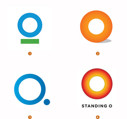
O
Yes, it’s an O! A veritable avalanche of full 360-degree, non-elliptical but very perfected, and thick as a cross-section of a suspect coronary artery logos are upon us. Kudos to each for finding some graphic differentiation through modification to its surface or supporting cast of shadows, bars, dot, stars, and stripes, and so on. As clean as these are, I am starting to miss a nice Bodoni O with a bit of line variance or maybe a forward-leaning italic O: With those, I know I’m looking at a letter and not just a vacuous circle. The difference between an O standing for something and a zero standing for nothing is slight indeed.
You would have to assume the Obama logo that was rightfully acclaimed for breaking ground and tradition in the realm of politics must share in the responsibility for this trend. As fresh as that mark was, its ubiquitous presence may end up accelerating the expiration date on followers. Consumers may well identify these similarities, leading you to ask: Will they believe there is an implied affinity between them, and will this influence their opinion of this entity?
1. Chermayeff & Geismar Inc., Conservation International 2. 1310 Studios, Orange Product Design 3. Today, Quantumize 4. Sparc, Inc., Standing O
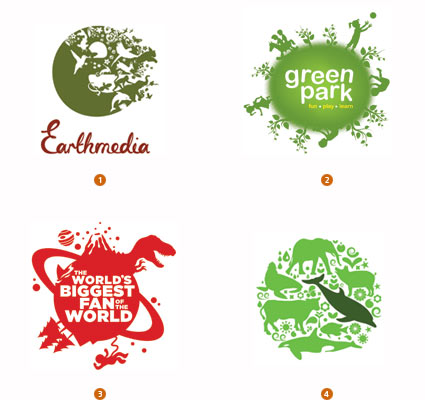
Earth
This is the solution for the client who wants to see his logo include everything on the Earth. Literally. Stylistically, this could certainly be broken into two categories: worlds with a perimeter populated by topical detail or worlds built out of topical detail. Since both variations have emerged simultaneously, we’ll treat them as the sustainability solution du jour. There is a certain whimsy about these logos, with their silhouette characters populating the orb like Gullivers in the land of the Lilliputians.
Part of the charm here is the dense amount of detail in a limited space. It starts to address the importance of our cohabitation and mutual respect as this big green cargo van is hurled round the sun. No attempt is made to define land mass or prime meridians, just a loosely round object with an exaggerated gravitational pull to keep its passengers on board. Minutia on a logo is generally avoided as it can vanish when scaled down, but this group seems to transcend this tenet by inviting the viewer to enter, magnifying glass in hand.
1. United by Design, Earthmedia 2. Blackboard, green park play school 3. Mattson Creative, Discovery Channel 4. Troyca - Visual Solutions GmbH, Troyca
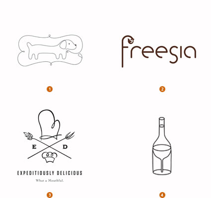
Monoline
An old rule of thumb to the socially adept was you can never to too rich or too thin. There is a certain elegance in an ultra-thin line, and this has never been lost on designers. Challenging as these may be on aging eyes, when designed well and not under-scaled, they will coax a pair of readers from the viewer’s pocket.
More than a few typographic marks have also picked up a spa membership in the last year. This is seen in script and in san serif display type. Note that in the type and illustration solutions, the line is not variable but rather a mono-weight.
1. Vistaprint, Vistaprint 2. FCB Durban, Oubaai 3. RDQLUS Creative, Expeditiously Delicious 4. Sommese Design, Dantes Restaurants
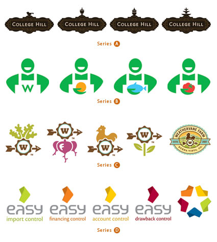
Series
A single client having a series of logos is absolutely nothing new. This is a time-tested solution to maintaining a core, consistent visual identity while focusing on specific divisions, products, or services. What is remarkable is the sudden ubiquitous deluge of these family marks.
In some cases, there is a parent mark that the family is constructed to relate to. Yet in others, every logo is of equal importance, and there is no single flagship logo. Nickelodeon exemplified this years ago with a common typographic solution knocked out of an orange field of fill-in-the-blank. But that solution relied more on the volume of solutions rather than the specificity of topic.
One consideration might be the expansive adoption of icon sets for mobile devices or Internet apps, which have built greater consumer familiarity with the concept of allowing a core icon to be redressed to take on multiple focuses. Color-coded series can be the least effective of these if the audience must memorize a system. Equally dangerous is the consumer not recognizing that a single mark is part of a greater system because of lack of context.
A) Gardner Design, College Hill Neighborhood Association B) Hulsbosch, Woolworths Limited C) Sunday Lounge, Weathervane Farm D) Sebastiany Branding & Design, Softway
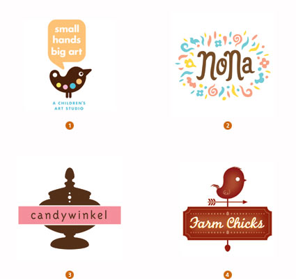
Brown
Every year we see color preferences ebb and flow, and if notable enough, we will mention this in the also-ran section at the end of the report. This year, with full apologies to UPS, designers discovered what brown could do for them. This was an abrupt and more universal movement, which warrants its appearance in the trend section.
It’s as if the volume knob had been pegged on black for maximum contrast for the last two decades, and we suddenly discovered it could be turned down and consumers could still hear us. This movement is about subtleties and is indicative of a new generation. Tone ranges from sepias, to chocolates, and even warmer.
Saturation levels of secondary colors have dropped back as well. Pinks always work well with brown, but other colors are being paired up here as well. Generally, these are clean colors that have had their chroma drained by half.
1. 1310 Studios, Small Hands Big Art 2. Gerren Lamson, NONA 3. Defteling Design, Candywinkel 4. Odney, MBT's
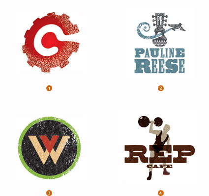
Dandruff
Proof that a little interference can truly break the tension. Any of these logos could survive without the dusting of white, but it is what helps set these marks in a hand-crafted genre and makes them more approachable. Crumpling, creasing, skewing, and distressing the art to create the prewashed look has been popular for years. This subtle effect has a few of its own differences that set it apart from the common methods of abuse.
This spritz of the logo surface is not always universal. More often it is applied only to specific areas of the mark. The open negative areas allow for the substrate to peek through, giving the logo a strong sense of place. If there is an attempt to emulate a look, it may be that of a block letterpress print that wasn’t liberally inked. Because only limited areas of the mark may use this effect, these logos are able to live with one foot in the future and another in the past.
1. Helius Creative Advertising, GearSwap.com 2. Gardner Design, Pauline Reese & Blake Behrns 3. Carol Gravelle Graphic Design, Los Padres ForestWatch 4. Pierpoint Design + Branding, Rep Cafe
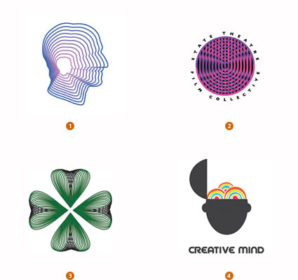
Concentric
Yes, they are pushing the boundaries on acceptable levels of detail and reproduction challenges. But this crop of logos has an almost hypnotic optical mystique to charm the consumer. Repetition of fine lines concentrically crafted to play out an image may symbolically achieve the same effect as the cross-section of a tree telling the story of a life. It can be the tale of a journey or the timeline of a process. Scientific in nature, the creation of these marks is closely tied to the technology that helped spring them to life.
These designs are almost a cross-pollination of Spirograms (mentioned as a sidebar last year) and Jawbreakers (discussed in the trend report from three years ago). Many of these may conjure up a Timothy Leary moment. Whether used as the foundation of the mark or just as a portion, these solutions have dizzying impact on the viewer. This challenges, and like it or not, forces the consumer to confront the mark. They demand a reaction.
1. Notamedia, gogol.tv 2. Sommese Design, State College State Theatre 3. Clover Creative Group, LLC, CLOVR Media Inc. 4. Vectory Belle, Web Application
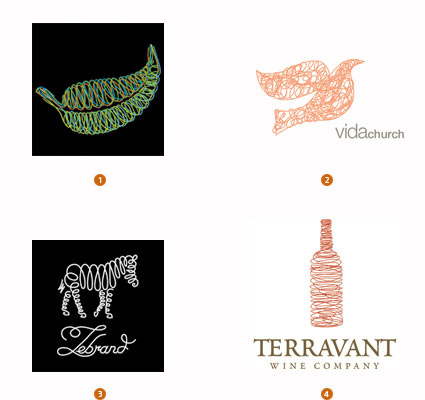
Loopys
Spoiler alert: The following trend deals with the surface treatment of logos. Jump to the next trend if hand-wringing of more than two hours is likely to result.Seriously, while we all love discovering a logo that combines solid draftsmanship with clever concept and a memorable shape, we also have to acknowledge that exploration of diverse surface technique is a thriving business. Designers are hell-bent on discovering and laying claim to the next genre of surface decoration.
Marks in this latest group have a special looseness and casual appeal. A clearly handcrafted loopy, loopy line is applied to the surface of an otherwise unremarkable but recognizable shape. In fact, this scribbling is the punch line to the logo. No pretentious calligraphic thick and thin strokes here. The whole affair is once again crafted using a monoline technique, which has become a common thread in several of this year’s trends. Other noted logos this year were silhouettes, similarly filled with a more erratic scrawl, but they lacked the modest panache exhibited here.
1. Noetic Brands, Green Bills 2. Shawn Wideman, Vida Church 3. petervasvari.com, ACTUART 4. Kraftwerk Design Inc., Terravant Wine Company
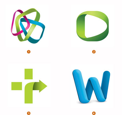
Banded
Exhibiting symptoms of an identity disorder, these marks demonstrate signs of being perfectly happy in flatland when suddenly they want to roll up off the page for a stroll in the 3D world. These marks are often constructed of a band that could be colored plastic or some other extruded substance. The notable identifier is the need to create a shadow on one’s self when turning a corner, but not casting a shadow on the page as they are not really of our world. Some examples of this trend have pretty grandiose dimensional tendencies, while others merely hint at an attempt to take flight.
Embracing the pleasures of working with gradients, designers are discovering that dimension plus shape equals unexplored territories. Flat, lifeless concepts take on pleasurable dimension that is attractive to the consumer’s eye. Though not the only one, this technique presents a graphic compromise for the purist between flat vector shapes and the crystal-capped dimensional hysteria of the last decade. The Microsoft Office for Mac suite icons formally cast long shadows and had a full-on dimensional appearance with bulbous shapes covered with light pings. Frog Design has dramatically reigned in the dimensionality and the shadow, as seen here.
1. BrandBerry, Artive 2. Higher, Voscast 3. Dickerson, Healing Touch 4. Frog Design, Microsoft Word
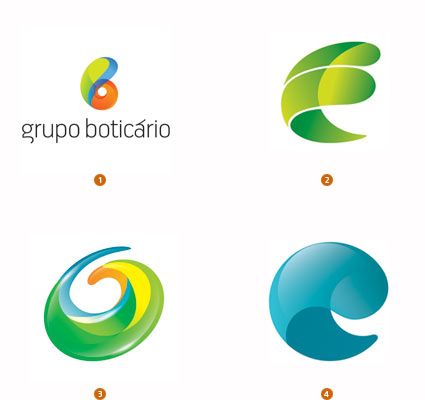
Comma
What is it about this shape? It continues to reoccur in broadly differing incarnations. It’s an unexplained obsession, like when Richard Dreyfuss tries to craft the alien landing site out of mashed potatoes in “Close Encounters of the Third Kind.” We’re calling them “comma” because they look like a large, dimensional comma or maybe a bit of a nautilus shell playing out the concept of mathematical perfection. There’s a swirl in play that tells us motion is a part of the story as well. Or maybe it is a seed unfurling as it prepares to spring into life in a new form.
The rendering of these obviously varies but the primary commonality in these examples is the transparency, with dimensionality dialed way up and a color palette that vividly attaches us to nature in an unearthly way. Like the Orb trend seen years ago, these marks seem to be imbued with a visual magic that tells the viewer not to look for reasoning but just believe.
1. FutureBrand BC&H, Grupo Boticário 2. Karl Design Vienna, Bertha Benz Challenge 3. BrandBerry, Olive 4. Baris Atiker, Euroclean
Buckys
Tangrams be damned. As Buckminster Fuller (father of the geodesic dome) suggested, the triangle is the only flex-cornered polygon that holds its shape. Ergo, it alone accounts for all structural shaping in the universe. Like those building blocks of the universe, designers are embracing the use of a field of these modules to carve out space, dimension, and shape. The clustering of many triangles to form a greater whole tells the story of strength in numbers, and it can also create a mosaic of diversity.
Bass Ale took ownership of the single red triangle as one of the oldest recognized trademarks on record. Though that single perfect geometric shape is certainly iconic, it is also an unpleasant bear with which to design. Single triangular logos are certainly stable, but they nestle poorly with type and can create awkward negative areas. Pair them, triple them, or batch them up, and they become a wonderful, malleable skin that can be arranged to take on nearly any shape or dimension—and with Bucky’s approval as the strongest shape in the universe.
1. Siren Design, Berkeley Estates 2. Vladimir Isaev, Telecom trade company 3. Dee Duncan, Razorfish 4. Publicity Upstream, Nouveaux Marches de France
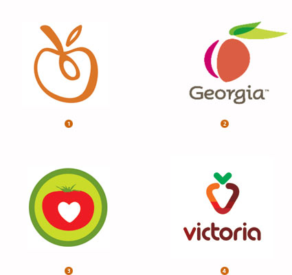
Fruit
When is an Apple not an apple? When is a Blackberry not a blackberry? When they are symbolic of the world’s leading brands in technology, innovation, and communication. So the leap to viewing a piece of fruit as an iconic representative for something other than an orchard or a jelly manufacturer is not unfathomable. Over the last year, this sweet nugget of nature’s perfection has been everywhere in the field of identity.
Every type of fruit is a vestige of stories and memories consumers can relate to. It is a tactile, familiar, and generally sweet spokesperson for nature and sustainability. They represent the result of our labors and proof of work performed, and are a symbol of purity and procreation all in one.
These self-contained reproduction vehicles are packed with the symbolism we love to evoke for so many clients. Ask anyone to draw a specific piece of fruit, and they will resort to a visual shorthand of shapes, leaves, and stems which are recognized universally. The trend may reach saturation, but as a rule, you won’t hear too many folks suggesting too much fruit is bad for you.
1. Strange Ideas, Hunger Free Heartland Foundation 2. Iconologic, MS&L Worldwide 3. RJ Thompson, H.J. Heinz Company 4. Denis Aristov, KS-Stroy
Subscribe to:
Posts (Atom)